#forecast 020 : Peak fear
Dear subscribers,
Welcome to The Bitcoin Forecast #020.
In the last forecast, the on-chain structure was heavily bearish with tidal waves of coins moving into exchanges to be sold by large and relatively new investors. I suggested possibly months for a recovery. Since then, price has fallen from $44k to as low as $29k and is currently consolidating around the mid-$30k region. In this letter we delve into whether Bitcoin is still in a bull market and if so, we ask how long the recovery may be.

Top level summary for 2nd Jun 2021 (current price $37.8k):
Macro long term: In terms of where we sit in the full macro cycle, Bitcoin is still in a bull market. User growth continues to climb against a price dip, while price is clearly below fundamental valuations. The on-chain data points to BTC price recovering and moving on to higher valuations in the latter part of this year.
Medium term: The medium term picture (over the coming months) is of course a question of how quick will the recovery be. The underlying structure resembles the COVID white swan crash which recovered over a period
of 8 weeks, I do not expect a protracted recovery period as many pundits fear. My educated guess is a recovery (back to the $55k-$65k region) in 4-6 weeks from the present situation, given the framing against what we saw during COVID.
Short term: Many
of the short term on-chain indicators are neutral, siding on bullish. While there is some down-side risk, my expectation is sideways bullish over the next 2-3 weeks. I’d also note the down-side risk is limited as we’re in a region
of being deeply oversold over fundamental price.
Analysis Breakdown
Network user growth is increasing, the bull market is intact
Probably the most pressing question investors have at times like these is “are we still in a bull market?” Let’s dive into this first and foremost.
Glassnode: Live chart >
link
A key indicator that a Bitcoin bear market has set in comes when the growth of users joining the network starts declining, this has been true for every bull market top
in Bitcoin’s history; bull markets end when there are no new buyers to sustain the higher prices. Presently we are seeing new users taking the opportunity to buy Bitcoin for the very first time during this price dip. This is a key
sign that we have NOT entered a bear market.

A fight to stablecoins, there’s a lot of dry powder
A flight to stablecoins, there’s a lot of dry powder
As the entire crypto market sold off to USD, there’s really two choices; (1) move money to USD and withdraw it via banking paths or (2) move to stablecoins, coins that track the value of USD. The latter being the choice of investors who wish to shelter from bearish phases yet want to have that USD in digital form to flow back into the markets quickly and easily.

Glassnode Supply Ratio (SSR) tracks the size of Bitcoin’s market cap value compared to the combined value held by the major stablecoins. A drop in SSR means an expansion in the stablecoin supply relative to Bitcoin’s size, and therefore a lot of “dry powder” ready to flow back into crypto markets.
Here, in the chart above, I’ve corrected for the downward drift of SSR (which is due to the increasing use of stablecoins in DeFi and other use cases such as collateralising trade and remittance). We can see stablecoins are near their historical maximum.
This is a lot of dry powder that has chosen to remain in the system ready to flow back into BTC, and it’s near a zone that’s typical of a market bottom. Though it doesn’t preclude further down moves in price, it does suggest the downside is limited when compared to historical norms.

Price is well below fundamental valuation
While there’s a lot of money on the sidelines ready to flow in, let’s take a look at BTC price compared to fundamental valuations.
PlanB’s stock to flow model, which values Bitcoin according to scarcity dynamics, is
approximately $65k. Meanwhile
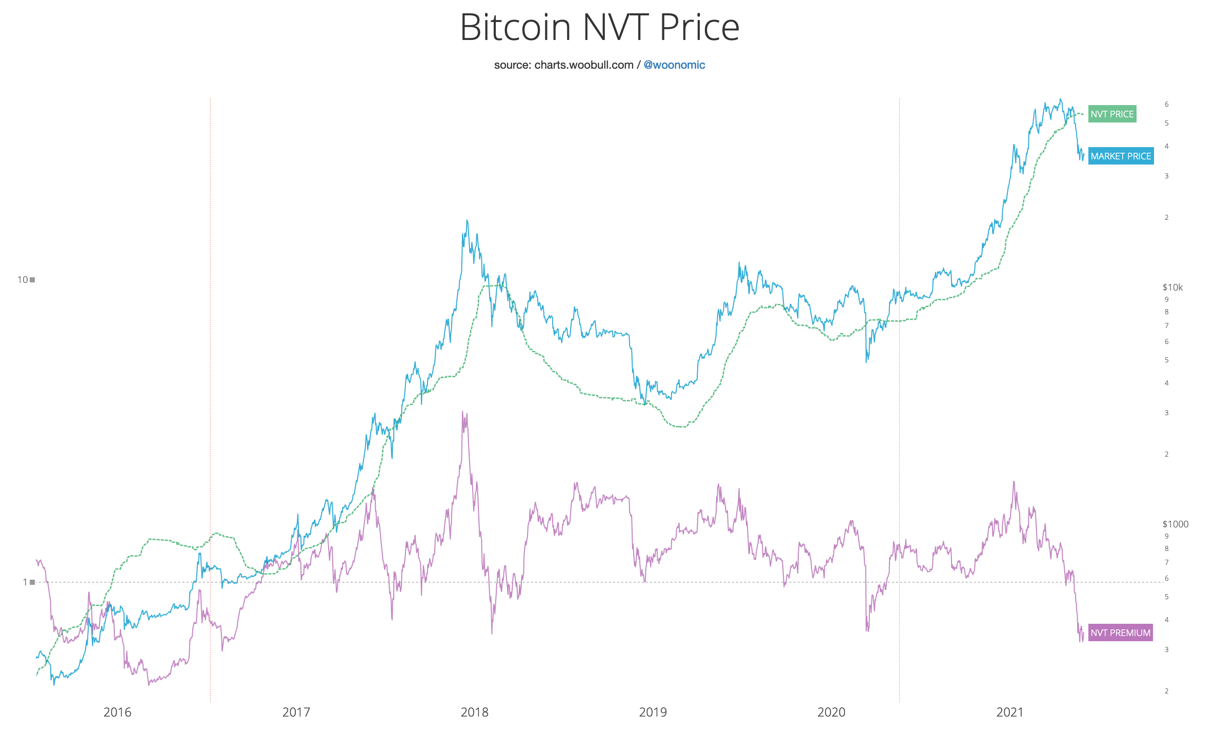
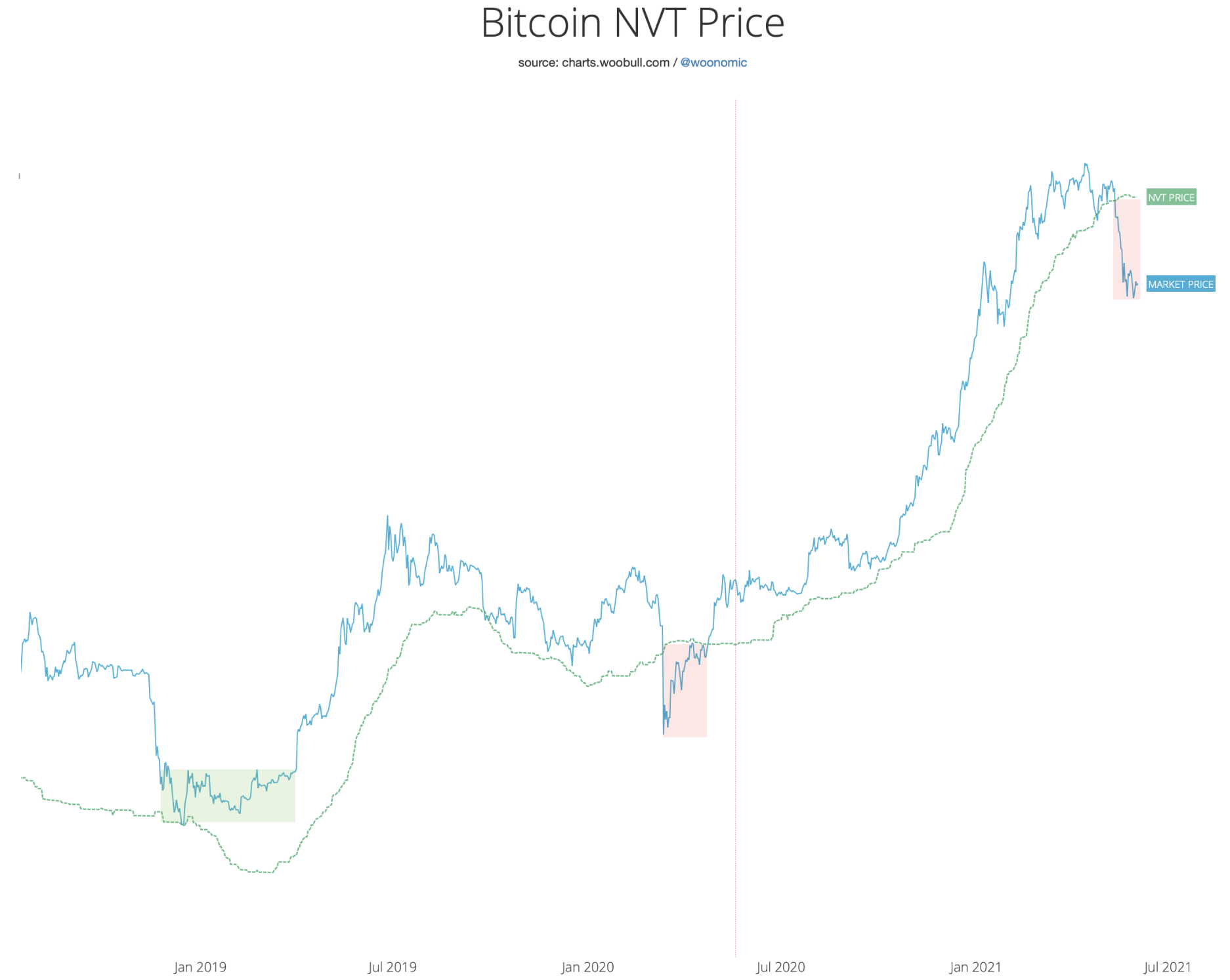
NVT Price, my own fundamental valuation for Bitcoin using the volume moving between investors, is currently at $55kThe NVT Premium in the chart above shows just how discounted BTC price is from its fundamental valuation (NVT
Price). Again the downside is limited as we are already near peak levels of undervaluation.
The NVT Premium in the chart above shows just how discounted BTC price is from its fundamental valuation (NVT Price). Again the downside is limited as we are already near peak levels of undervaluation.
To further push the point home, by z-scoring NVT Premium, we can see how discounted BTC is compared to earlier events in BTC’s price history while taking into account BTC’s reducing volatility over its 12 year history. We are now at maximum levels of relative discount.

The BTC sell-off is completed
Two week moving average of exchange flows, the lighter red line denotes the 12 hour moving averageWhile BTC is selling at a discount, the tidal waves of BTC flowing into exchanges to be sold off have abated. Shorter term flows are reverting to bullish, with coins being bought and moving off exchanges.
The selloff is very much near completion. The important question right now is: “how long will the recovery take?”

Clues into the recovery
In the modern era of Bitcoin markets, where well developed leverage and derivative markets have existed, BTC has seen three selloffs where price crashed in the region of 50%.
Namely:
> The capitulation at the end of the 2018 bear market
> The COVID white swan crash
> This present crash
We can get a clue to the underlying structure by using Glassnode’s liquid supply change metric, essentially tracking coins moving between strong hands (long term investors that do not sell much) and weak hands (speculative holders
who buy and sell). This is the metric that I call the “Rick Astley” chart.
This chart on the right : 7 day moving average of coins moving between strong and weak hands
In this chart, I’ve adjusted the standard Rick Astley chart by Glassnode to use a shorter time frame moving average so we can see more clearly the signature behaviour of coins moving between investors.
It’s clear to see (in the purple line of the chart) that in the 2019 bear market bottom (1) coins were accumulated slowly by strong hands. Whereas during the COVID crash (2) coins were accumulated at a much faster rate resulting
in a much faster recovery.
The present situation has not yet resolved, but so far the fractal signature looks very much like the COVID crash, with similar peaks of selling to weak hands, and a similar recovery to strong hands.
With this in mind, and the fact that we are well below fundamental valuation (as seen in the chart above), I’m siding on a faster recovery similar to COVID.

Investor activity signalling we are in a solid buy zone
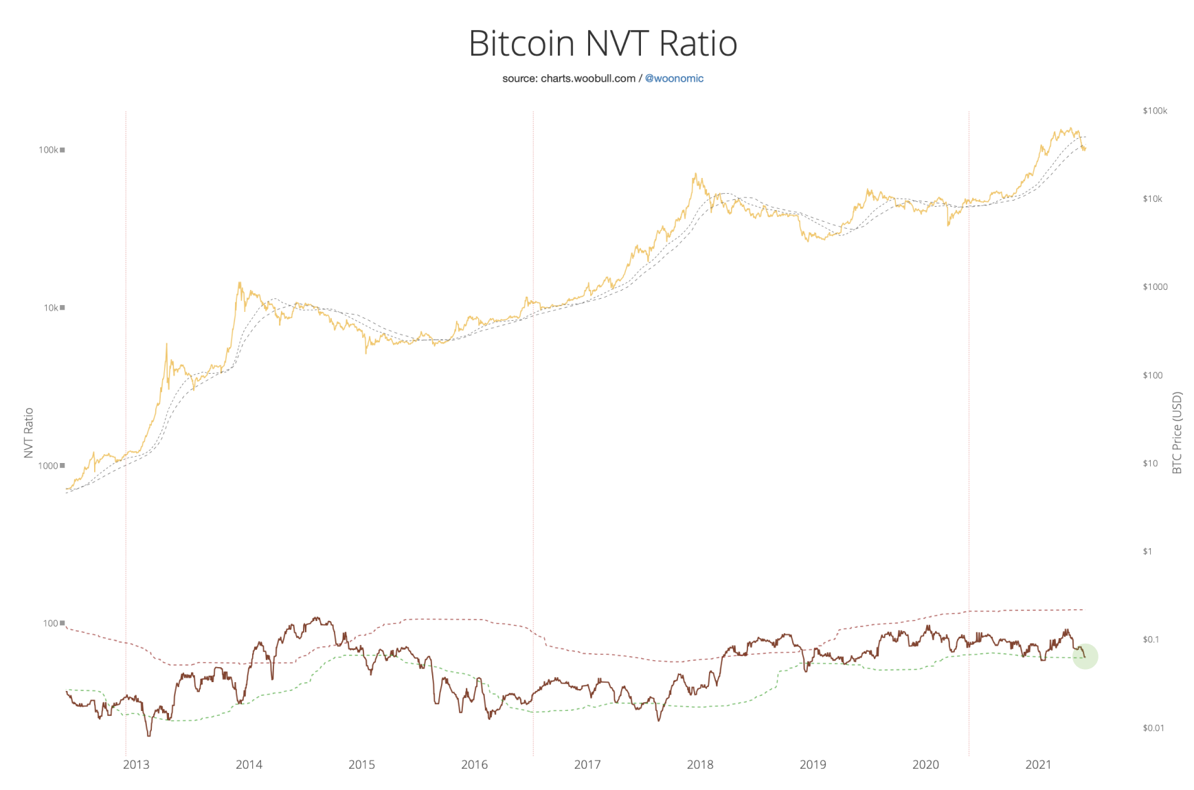
Finally I’ll leave you with NVT Ratio, which gauges investor activity (volume moving between investors) and the network valuation. This long range indicator is now once again in a solid buy zone. BTC price is far below the levels warranted for the current investment activity.Bitcoin NVT Ratio chart.
Links and References
Newsletter Archives: The Bitcoin Forecast
Data Provider: Glassnode (free on-chain charts, paid tiers available)
Glossary: Glassnode Academy (definitions for these on-chain metrics)
Twitter: @woonomic
Woobull on-chain charts: charts.woobull.com