Candlestick on price charts are a popular type of financial chart used by traders to visualize price movements in various financial markets, including stocks, forex, commodities, and cryptocurrencies. Candlestick charts provide more
detailed information about price action compared to traditional line charts, making them a valuable tool for technical analysis. Each “candlestick” on the chart represents a specific time period, such as a minute, hour, day, or week.
It’s important to note that while candlestick patterns can offer valuable insights into potential price movements, they should be used in conjunction with other technical analysis tools and indicators to make well-informed trading
decisions.
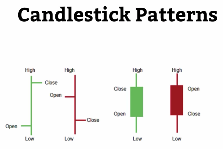
A SINGLE CANDLE-STICK
*This section is for people who are very new to candle sticks or charts, and hence for those who are already familiar with this should move to the next page.
The colors of candle stick:
The structure of the candle stick:
This graphical representation on a candlestick chart is to help summarize what is happening with price. It tells you a story.
*This section is for people who are very new to candle sticks or charts, and hence for those who are already familiar with this should move to the next page.
A candle stick represents price action within a time frame.
A single candlestick consists of several components:
Body: The rectangular part of the candlestick represents the price range between the opening and closing prices of the given time period. If the closing price is higher than the opening price, the body is usually colored (traditionally green or white) to indicate a bullish (upward) movement. If the closing price is lower than the opening price, the body is usually filled (traditionally red or black) to indicate a bearish (downward) movement.
Wicks or Shadows: The lines extending from the top and bottom of the body are called wicks or shadows. These lines represent the highest and lowest prices reached during the time period. The upper wick extends from the top of the body to the high price, while the lower wick extends from the bottom of the body to the low price.
The colors of candle stick:
In general, red candle sticks denote price has dropped. Meaning price in that time ended lower (body of the candle) than when it started.
Green candle sticks denote the opposite, price ended up higher than when it started.
The structure of the candle stick:
The structure or overall picture of the candle stick tells you the summary of price action.
For example below, the HAMMER candle stick has a long wick below the body compared to the top (no wicks) and to the rest of the body of the candle stick.
This tells you, strong buying pressure came from the bottom. Hence why the following candle sticks moved upwards.
* click on image for a closer look
What you see here are many individual candle sticks and together they represent price action (price movement) over a particular time frame.
This graphical representation on a candlestick chart is to help summarize what is happening with price. It tells you a story.
CANDLE-STICK TRADING
Candle sticks are 1 of 6 elements (indicators being a support tool) used to understand the price action on a chart.
Candle sticks are 1 of 6 elements (indicators being a support tool) used to understand the price action on a chart.
As you gathered, the others are:
1) Candle sticks
2) Support and resistance
3) Trends
4) Moving Averages
5) Fibonacci levels
6) Divergence / convergence
It is very important you understand candle sticks and their many possible combination, for candle stick and their associated grouping can contribute to determine if its a bullish or bearish price action to follow.
Its not as important to memorize each of these formations, however if you do, its a good thing, especially the following below.
One can always refer to a source of listed candlesticks. Here is our list and growing >
https://tradetoprospa.net/candlestick-patterns/
Candle stick patterns that you must pay extra or special attention to include:
Single candle sticks :
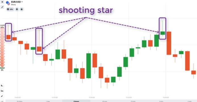
Shooting star, Hammer, Pin Bar, Doji and Marubozu
2 candle stick combination patterns :
Tweezer tops and bottoms, Harami and engulfing candles
3 candle stick combination patterns :
Morning star, Evening Star, 3 inside up or down, 3 white soldiers, 3 black crows.
What is important is for you to understand is why the candle or combination of them are bullish or bearish by just looking at them. Refer to the reference page to see how they are identified. Note the comments < strong,
reliable or weak formation.
To conclude:
a) Candle sticks help tell you what is happening but it must be in context of where they occur, known resistance or support levels. This is the key for using candle sticks, context!
b) Candle sticks should not be used in isolation to generate trading signals.
c) Candlesticks are helpful especially with certain trading strategies where they use major elements on a chart (with support, resistance and trendline).
BULLISH AND BEARISH CANDLE-STRICKS
Bullish and Bearish reversal candles come in many formations. Below is a list of the major single candles.
> Doji
Morning Star
The Morning Star Pattern is viewed as a bullish reversal pattern, usually occurring at the bottom of a downtrend. The pattern consists of three candlesticks.

Bullish and Bearish reversal candles come in many formations. Below is a list of the major single candles.
This link provides a comprehensive list
Candle stick patterns
> Doji
> Bullish & Bearish engulfing signals
> Hammer
> Hanging man
> Piercing pattern
> Dark cloud
> Bullish harami
> Bearish harami
> Morning and Evening stars
> Kicker signals
> Shooting star
> Inverted hammer
Single candle sticks are usually weak in the smaller time frames so we look for candle stick combinations. This section cannot cover all the possible scenarios hence we have provide a reference page link here that provides the major combinations. Add this page to your bookmark – Candle stick patterns
Some examples:
Morning Star
==========================
The Morning Star Pattern is viewed as a bullish reversal pattern, usually occurring at the bottom of a downtrend. The pattern consists of three candlesticks.
The morning star is a bullish, bottom reversal pattern that is the opposite of the Evening Star.
Shooting Star
==========================
A shooting star is interpreted as a type of reversal pattern presaging a falling price. The Shooting Star looks exactly the same as the Inverted hammer, but instead of being found in a downtrend it is found in an uptrend
and thus has different implications.
PRACTICAL EXAMPLES
How do we use candle sticks to help find our support and resistance lines?
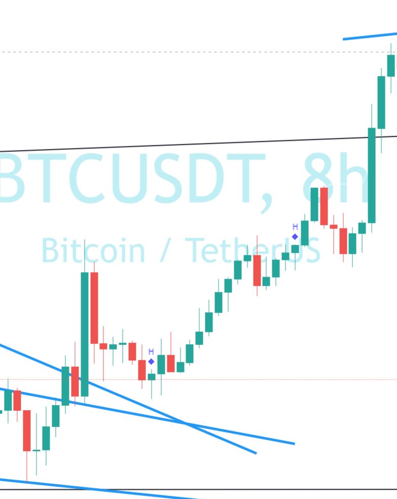
The 1st chart below is a screen shot of the BTC chart using Weekly candle sticks.
How do we use candle sticks to help find our support and resistance lines?
Watch these 2x video’s as they explain the different aspectspurpose of candle sticks and how they are used for trading.
The 1st chart below is a screen shot of the BTC chart using Weekly candle sticks.
Observe how we derive the weekly levels of support and resistance just by using our candle sticks. Note that we use the body of the candle to find the level and ignore the wicks.
Why? price fluctuates and ultimately at the end of the week, it gives defines where it closed and hence we take that closing level to represent all the activity in the week.
* Click on the chart for it to be enlarge.
TIME FRAMES
Do we look at the 1 hour time frame (TF), 2 hourly , 4 hourly , 8 hourly , 12 hourly or the daily chart for candle sticks.
Note on mindset
The 1st chart below is a screen shot of the BTC chart using DAILY candle sticks.

How do you determine what time frame to choose from when it comes to candle sticks?
Do we look at the 1 hour time frame (TF), 2 hourly , 4 hourly , 8 hourly , 12 hourly or the daily chart for candle sticks.
There is no easy answer and there is no general answer.
The answer comes from the charts and what you can deduce from it based on initial investigation, that makes sense.
Observe this example:
https://tradetoprospa.net/candle-sticks-example-1/
Note on mindset
What is important is that many charts will not always make sense and make you feel confident, initially and sometimes not at all, even after investigating. What you need to do is find charts that do MAKE SENSE, that have
predictability, sequence or rhyme about it. With such charts you need to find your groove, your comfort zone and this can change over time as you gain more experience. How? By doing many practical exercises.
The next video will provide some guidance to how to use candle sticks for decisionstrades.
The 1st chart below is a screen shot of the BTC chart using DAILY candle sticks.
Observe how we derive the levels of support and resistance just by using our candle sticks. Note that we use the body of the candle to find the level and ignore the wicks.
Why? price fluctuates and ultimately at the end of the week, it gives defines where it closed and hence we take that closing level to represent all the activity in the week.
* Click on the chart for it to be enlarge.
PRACTICAL EXAMPLE – Using Candlesticks to find support and resistance
The next chart below we have the daily chart and hence the daily levels of support and resistance lines.

The next chart below we have the daily chart and hence the daily levels of support and resistance lines.
Similarly to the weekly, we use the body of the candle to derive these levels.
Summary:
This technique helps define pivot points for price action. This method is the groundwork that must be done along with other methods to find levels of interest to help in many strategies to find an entry or take profit.
PRACTICAL EXAMPLE – What Time Frame
As we pointed out, candle sticks cannot be used in isolation to the rest of price action. It needs context.
How do we know what time frame to use and why chart elements we need.
As we pointed out, candle sticks cannot be used in isolation to the rest of price action. It needs context.
What do we mean by context?
Context means that we look at other components on a chart that has / gives purpose. Resistance or Support levels have purpose, as an example, not the only thing, but simplified, that’s all we need.
What other chart elements. Meaning:
i) Support and resistance
ii) Trends
iii) Moving Averages
iv) Fibonacci levels
v) Divergence/convergence
The rules or process to conduct technical analysis which is then directly related to working out a trade:
At a minimum, these following steps are required for all your charts.
a) identify your support and resistance levels;
b) place your 10 and 20 ema;
c) identify your trend (time frame); accommodate your ema range with price:
d) place your indicators, eg macd;
e) identify formations and trend lines;
f) now look at the candle sticks as price approaches a) support or resistance and/or Fibonacci or your moving averages.
g) work out what likely Elliot wave its at and what its likely to do, both HTF and STF.
This obviously requires you to know a, b, c, d, and e before making use of candle sticks.
*All of these are covered in the other modules.
Now for this exercise, we are going to place all of the above and now look at candle sticks and their formations to give us a signal.
This is covered in this video.